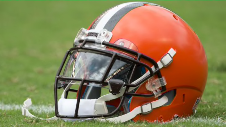
The Cleveland Browns finished last place in a fan vote on FanJuicer.com, and a graphic designer explained it had to do with a boring design
Some love the look and call it classic, others say it’s time for a reboot. No matter what the take is though, Cleveland Browns fans are passionate about their football team and likely get excited just by looking at the simple orange helmet logo.
They’re pretty much alone in that feeling though.
According to a recent poll on FanJuicer.com, the Browns logo came in dead last when being ranked against all other NFL teams.
More from Browns News
- How the Browns could maximize Nick Chubb in 2023
- Can Deshaun Watson get to Patrick Mahomes level for Cleveland Browns?
- 3 Cleveland Browns who should see an expanded role in 2023 and 1 who should not
- Is Marcus Davenport on the Browns radar in 2023?
- 5 Free agents from Super Bowl LVII Cleveland Browns should target
More than 1,400 fans were polled and it Cleveland finished with a total of 14 points in the voting, nearly half as much as the second-worse Jets who had 27.
The website also brought in an experienced graphic designer, who answered a few questions about each logo. Not only did he say there was no symmetry or anything pleasing to the eye, but he also called the helmet boring.
"“My first thought is that it is just not working. It’s boring. There’s nothing representing the Cleveland Browns here. You have this brilliant color here, but it is just a helmet. There’s nothing special about it, especially to someone who doesn’t know anything about football.” — Graphic Designer via FanJuicer.com"
There’s been a lot of talk recently about the Browns changing uniforms again, with 2020 feeling like a possible target date. Their last change of uniforms however didn’t touch the actual logo — other than a highly mocked change of color tone.
Other AFC North foes also fared poorly as the Bengals finished at No. 30, the Ravens at No. 26 and the Steelers were the best in the division at No. 21.
Next: Taking a deeper look at the RBs
The New Orleans Saints were ranked first and Detroit Lions were the second team in this ranking.
